Bootstrap 4: What's new and gotchas
Bootstrap 4 is the hawtness and we want to start using it. But what's new?What's changed? Am I going to be able to get my head around it? All these things and more we will uncover.
An in-depth look at migration and what has changed can be found here: http://getbootstrap.com/docs/4.0/migration/. I'm not going to rehash all that so you should read that first. I'm going to try and outline what these changes mean for us and the way that we work.
Globals and Variables
- Global options: http://getbootstrap.com/docs/4.0/getting-started/options/#global-options
- These are flags that turn on and off certain features. We should specify these in our _custom-bootstrap.scss so we can set them on a per project basis.
- $spacer variable looks interesting. If we base all our margin and padding off of it then we can control all the spacing by changing one var.
- Colour map variable can be customized with brand colours so we can use ${color} variables: http://getbootstrap.com/docs/4.0/getting-started/options/#theme-colors
- Variable maps for defining grid breakpoints and container max widths. '$grid-breakpoints', '$container-max-widths' http://getbootstrap.com/docs/4.0/layout/grid/#variables
- We probably will need to be overriding these on some sites.
- It’s also possible to define the grid tiers: http://getbootstrap.com/docs/4.0/layout/grid/#grid-tiers
Component based z-index variables to make it easy to stick something else above/below a given component. http://getbootstrap.com/docs/4.0/layout/overview/#z-index
- Navbar: Addition of `.navbar-expand{-sm|-md|-lg|-xl}` variable makes it easy to choose the breakpoint at which the collapse kicks out.
Grid
- '.no-gutters' class removes margins from rows and padding from columns—Helpful for 'full width' sections.
- Column classes no longer need an explicit breakpoint or column count. Any column should have a `.col' class. If you WANT to add a breakpoint or column count you can but you don't have to.
- Flexbox means that any '.col' will sit next to each other as long as there is room.
- You can set the column count of a single column and other columns will auto-size
- Use .col-{breakpoint}-auto to size columns based on the natural width of their content
- There are alignment classes for flex box alignment ('justify-content', 'align-items', etc) but they map directly to single css rules of the same name so it’s probably easier to write the rule rather than extend the class.
- Offset classes are gone in favour of margin utility classes like .mr-auto .ml-sm-auto. These seem a lot less precise compared to what we had but it’s a way to get things away from one another.
Components
- Media object would be useful for teasers with images that need to have the text floating next to the image but not wrapping.
- New ‘card’ component matches to what we would normally call a tout but super flexible. This 'kitchen sink' approach could have good synergy with Kalagraphs but I'm unsure how wise it is to make EVERYTHING some sort of Card variant. We should hash this out further.
- Example cards:
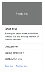
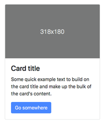
- Example cards:
- Other components are basically the same to use.
- Navbar: Things seem largely the same however everything is now implemented with flex box so you can use the flexbox utility classes for layout.
- Addition of `.navbar-expand{-sm|-md|-lg|-xl}` variable makes it easy to choose the breakpoint at which the collapse kicks out.
Utilities
- Use '.sr-only-focusable' in conjunction with '.sr-only' when you want an element to be hidden but visible on focus
- .img-responsive has been replaced by .img-fluid
Typography
- We now have 'display headings' in addition to normal headings. They are a larger, slightly more opinionated heading style. Might be useful, might not be.
- '.list-inilne' and '.list-inilne-item' gives us an inline list thanks to flex box. Good alternative to hijacking the `.nav` class to achieve similar result.
Javascript
- The file util.js is required by all libs so we need to always include that if using one of the plugins.